001: The first one!
TL;DR: Cross stitch pattern page, the Site journal feed and oooh! Pretty CSS!
So we begin! This is actually few days of work, from research of how to even wrangle HUGO to actually putting this weird thing together in a minimal-working-product style of thing. It’s been a decision to use HUGO at all, me being me wanting to know pretty much everything that will go on under the hood of my own website, I almost went with writing this entire thing by hand, and then a script to glue it together. Before an IRL friend reminded me that markdown static website builders exist (and pretty much do this exact thing). But me being me, I am still building most of this on my own, even if there are very fancy and very pretty themes and everything.
I either fully know how it works or BUST. I’ve hand-written my fair bit of nonsense, so if HUGO ever does something I don’t like, it’s basic enough that migrating it over into a different system (or, hell, just writing that gluing script myself) shouldn’t be THAT much of a slog. I’m trying to write this website as technology-agnostic as I can, pretty much. I’ve seen python scripts come and go, break terribly, Access databases changing a quoting style in a file it wasn’t supposed to— My point being. This thing is simple, and HUGO is thankfully a fairly simple tool.
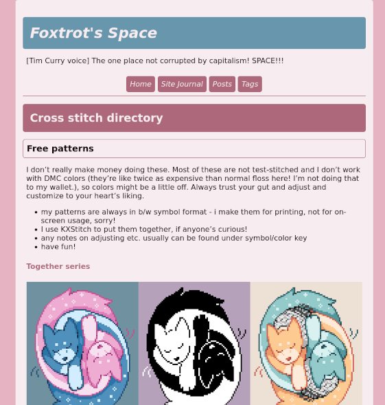
Anyways: the first (and easiest) thing to add was a little cross stitch page. I don’t have that many presentable patterns laying around, but they’ve been homeless for a while, and I really like the Together trio a lot. I really need to stitch it one day. At least the kufiya one - orange and blue are a weakness of mine.
And then the Site Journal! I’ve always wanted to write changelogs… Especially if they’re funny :) Though that might only come with time. There’s a lot of stuff to add here, first.
AND THEN! The theme. I’ve done a lot of themes I like already (green…. brown and blue… look, I have an appreciation for the cooler tones that Aren’t Blue Only), so I decided on, uh. Dusty pink. With dusty blue accents. This is a light, soft theme :)
Before!
After!
Who knows what the site will look like three years into the future!
Next on the list: More themes! (At least high-contrast grayscale and soft-contrast grayscale with light text backgrounds for now. I consider these basic accessibility theme picks - some folk just need specific colors to read, and if anything happens, the high-contrast grayscale one should play nice with many accessiblity plug-ins and tools.) Theme switcher! I’ve written it once and I’ll wrangle it into this system too, dangnabbit!
…Also more and better front page. The current one is a placeholder that isn’t really… About me nor the site? Just about the mess. We’ll see how personal I’ll end up being on the front page.
Also: the category page needs to have dates in there somewhere next to the headers. And a “keep reading” tab. Right now it isn’t the most intuitive to browse.
ALSO ALSO centered images. At least by default. Right now it’s stuck to the left and it haunts me.